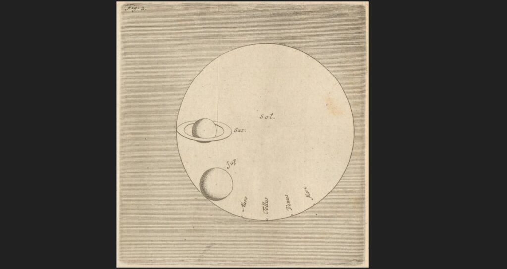
Check out the cool diagram below. It is from the 1698 book, Celestial Worlds Discover’d, or, Conjectures Concerning the Inhabitants, Plants and Productions of the Worlds on the Planets by the Dutch astronomer Christiaan Huygens. It quickly conveys a sense for the relative sizes of the sun and planets (which Huygens got pretty much right). If it looks like a lot of other diagrams you have seen, that is because Celestial Worlds was an important book for how we picture our solar system (more on that in a future post).
In Celestial Worlds, Huygens makes the case for a multitude of inhabited worlds. His arguments are like those presented eleven years earlier by Bernard Le Bovier de Fontenelle in his Conversation on the Plurality of Worlds (which featured in my recent article in Sky & Telescope—click here). The arguments hinge on things like a presumption of similarity between the Earth and the other planets, going all the way down to an argument that there would be ropes and pulleys on Jupiter and Saturn, because why would Earth be the only place to have them? This is despite the fact that Huygens’s diagram shows the planets being very much not similar in terms of size and, in the case of ringed Saturn, of appearance.
Within all this, Huygens makes the following odd comment regarding his diagram: “And ´tis remarkable that the Bodies of the Planets do not increase together with their Distances from the Sun, but that Venus is much bigger than Mars.” Why would he say this? Who would ever think the planets got larger with distance from the sun?
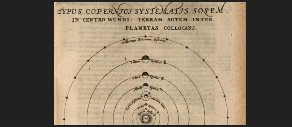
Johannes Kepler, for one. In his 1618 Epitome of Copernican Astronomy he wrote, regarding the planets, that “nothing is more consistent with nature than that the order of their magnitudes should be the same as the order of their spheres, so that of the six primary planets, Mercury should be the least, Saturn the greatest, inasmuch as the former is moved in the smallest, the latter in the largest orbit.”
Jeremiah Horrocks concurred, arguing that the diameter of the planets should scale with the diameter of their orbits, so that all the planets would appear the same size as seen from the sun, including the Earth. “Surely,” he wrote in an essay about using a telescope to observe the 1639 transit of Venus across the sun’s disk (not published until 1662), “if the Earth agrees with the others as to motion, and if the proportion of its orbit to that of the rest [following Kepler’s laws of planetary motion] be so exact, it would be ridiculous that it should differ so markedly from the others in the proportion of its diameter.”
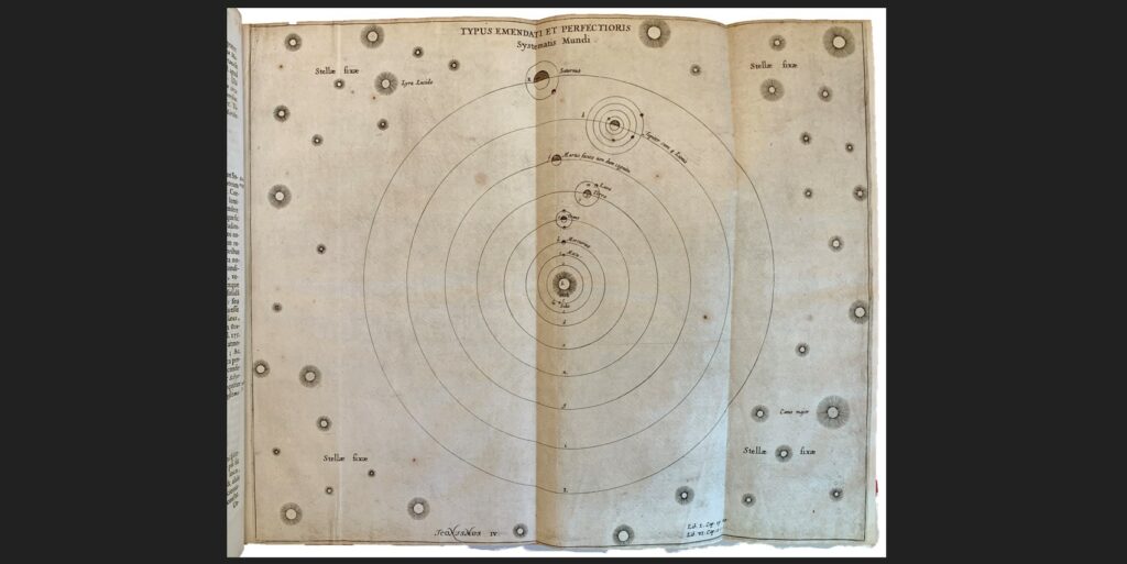
Otto von Guericke was of the same mind. He included a diagram of the solar system in his 1672 New Magdeburg Experiments, which showed the sun and its planets, set in a universe of sun-like stars that extended indefinitely out into space. The diagram includes some things visible only telescopically—the moons of Jupiter, a moon orbiting Saturn (Titan, discovered by Huygens in 1655), and sunspots (which Guericke interpreted as bodies orbiting the sun). The planets clearly increase in diameter with distance from the sun.
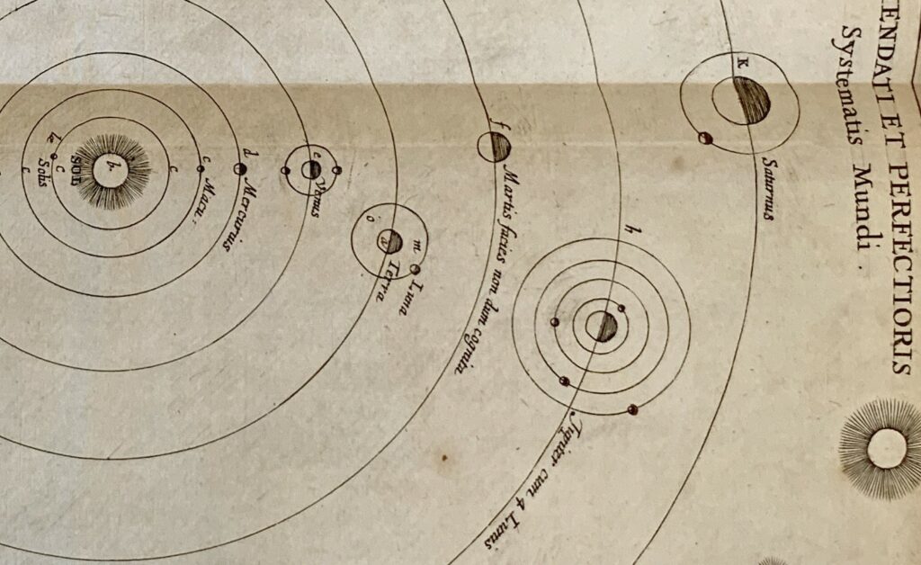
That solar system diagram is not the only one of Guericke’s that shows planets progressively increasing in size with distance from the sun. Here is a simpler one that also emphasizes that progression:
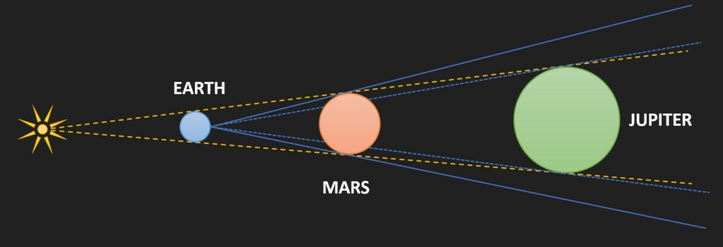
Guericke obviously really liked this idea. This is all despite the fact that such a progression is impossible. If the diameters of Mars, Jupiter, and Saturn are such that they would all appear the same size when seen from the sun (yellow dashed lines in the figure below), then, when seen from Earth when they are nearest, Mars would have to look much larger than Jupiter (blue lines).
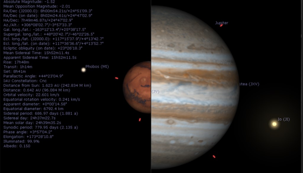
But as seen in the Stellarium simulations below for Jupiter and Mars viewed at their upcoming closest approaches (in December and January, respectively), Mars does not look larger than Jupiter. It looks much smaller, in fact. The appearances of the other planets do not agree with Guericke’s diagrams, either.
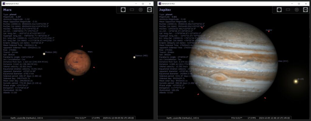
Granted, seventeenth-century telescopes could not produce Stellarium-quality images, but they could show the disks of Mars and Jupiter. Guericke’s solar system diagram is an illustration of an idea or a concept that was thought to be attractive, or elegant, or “consistent with [our ideas about] nature” winning out over science—winning out, that is, over observations, measurements, and calculations. Eventually, of course, the science won out. Huygens’s planetary sizes were correct. His ideas about Saturnian pulleys, on the other hand, were not correct, and more akin to Guericke’s planet sizes.
Science is self-correcting, it is often said. But as Br. Guy and I argue in When Science Goes Wrong: The Desire and Search for Truth (click here for it), that can take a while, and in some situations, being self-correcting is obviously not good enough. Maybe we should have included Guericke’s diagram in the book.

