The greatest scientific question of our day has surely been the Great Pandemic of 2020. The global response to the Pandemic, and the resources and scientific know-how poured into that response, must rival even the building of the Suez and Panama canals, or the Apollo missions. This is of course Sacred Space Astronomy, but we do address other matters of science here. Here I am going to contribute some analysis of the Pandemic, at least as it appears in my corner of the world (Kentucky, USA), and of science and people’s view of science.
Understand, O Reader of Sacred Space Astronomy, that I offer no unique insight regarding the Pandemic. I have no training in this particular field. The data that I use for this analysis is publicly available from Kentucky’s COVID-19 data site: https://govstatus.egov.com/kycovid19. Anyone with a spreadsheet can do what I do here. What I offer is the view of a person with basic scientific insight, some historical insight, and a willingness to do the math.
Indeed, from the beginning of the Pandemic I have maintained a spreadsheet of Kentucky’s COVID-19 numbers:
- number of TESTS administered
- number of CASES of the disease
- number of HOSPITALIZATIONS
- number of ICU (Intensive Care Unit) cases
- number of DEATHS from the disease
(Click here for the spreadsheet and all the numbers.) Below is a plot of the cumulative total number of each of these, over time, in Kentucky for roughly the past year. The vertical axis in the plot is logarithmic (if you did not see my post from last week on rates of increase and logarithmic plots, click here for it).
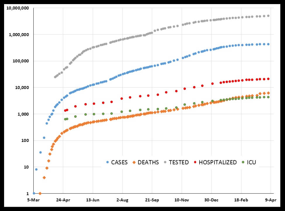
What strikes me as remarkable is how, after an initial very rapid rise, these quantities all exhibit a very steady rise across the plot. From roughly the beginning of May 2020 through the end of January 2021 all five of these quantities show this. Here is the same plot, just “zoomed in” a little:
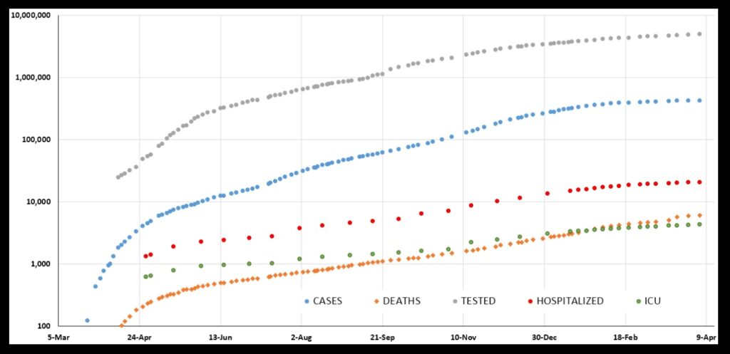
The least steady quantity is TESTS. That makes sense. Unless people get truly sick, they choose whether or not to get tested. So, the number of tests will vary with their choosing. That choosing can be influenced by, for example, the weather: bad weather will influence how many people venture out for a test.
The number of tests will in turn influence the number of CASES to some extent. Lots of cases of COVID-19 are mild or symptom-free, so they will not be revealed unless people go out for a test that shows that they are indeed infected. So, things like weather will influence the number of cases, too. Scientists might say there is “noise” in the case data.
The other quantities—HOSPITALIZATIONS and ICUs and DEATHS—likely have much less dependence on things like weather, thus maybe less noise. They show the steadiest rises across the plot. DEATHS, in particular, looks almost like a straight line across the plot.
But we are looking at straight lines—steady rises—across a logarithmic plot. A straight line on a “log plot” means exponential growth. For most of the pandemic, Kentucky saw exponential growth in hospitalizations, ICUs, and deaths from COVID-19. Let us take a closer look at these things (and this discussion will use many concepts from my post from last week on rates of increase and logarithmic plots—click here to see it).
Looking at the DEATHS chart, the rise looks very steady from May 21, 2020 through February 14, 2021. I fit an exponential to this span of dates (highlighted):
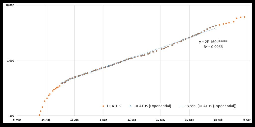
Indeed the plot is clearly exponential. The “R-squared” value for the fit is 0.9966 (the closer R-squared is to 1.0, the more perfectly exponential is the plot).
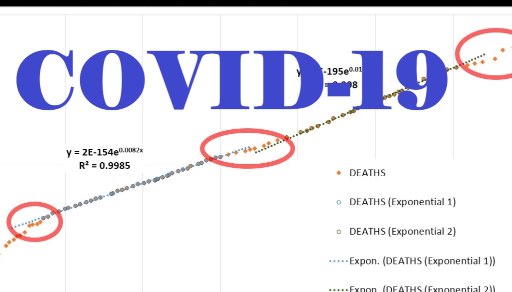
But this fit reveals to me that the plot in fact contains two sub-regions that are more perfectly exponential. First there is May 30 through September 21, and then there is November 3 through February 20. Here they are:
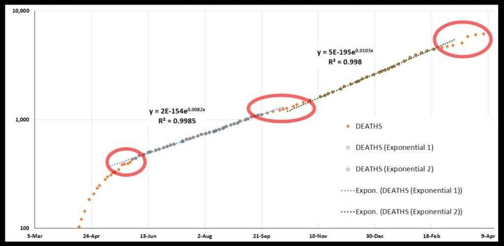
The first fit for these two regions has an R-squared of 0.9985, the other 0.9980. The rate of increase is greater for the period of Nov 3-Feb 20 than for May 30-Sep 21.
What does this tell us? It tells us that—
- Kentucky had an initial explosive growth in deaths.
- There was a brief letup in May (first red circle).
- In late May there began an extended period of exponential growth that lasted until late September.
- There was then a brief letup in October (second red circle).
- Another extended period of more rapid exponential growth began in early November and continued well into February.
- There has been a letup since mid-February (third red circle).
The big jump in deaths visible in March is by reason of a large batch of uncounted deaths that were later added into the total. Yes, that could mess up the data here, but thanks to other numbers I do not think it messed things up too badly.
Why not? Let’s look at the HOSPITALIZATIONS and ICU plots (again, these are cumulative totals, meaning total numbers of people ever in the hospital or the ICU). These both show very exponential growth across the same time period. Thus I think the overall pattern holds, despite the state having mislaid some deaths data over a period of time:
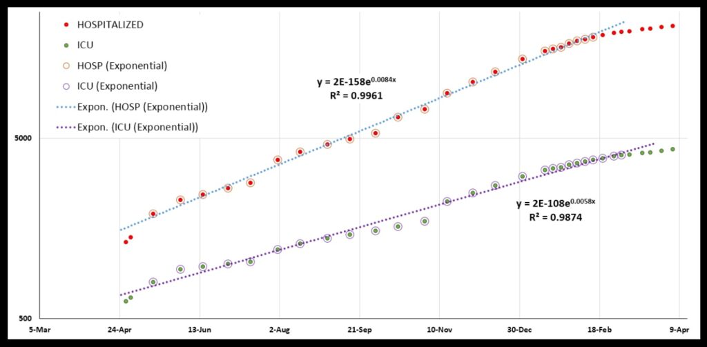
The fact that everything is so clearly exponential is characteristic of a very simple disease spread pattern: the number of cases increases by a fixed percentage in a fixed period of time. In Kentucky, the number of cases increased from 10,000 at the beginning of June to 20,000 by mid-July: an increase of 100% in six weeks. In another six weeks, it had increased by another 100%, to over 40,000 (actually, to a bit over 40,000, but recall that none of this data is perfectly exponential—no R-squareds of 1.0—and the case numbers certainly are not perfectly exponential).
This simple spread is what is expected if every person who has the disease has a certain chance of passing it on to whoever he or she meets. If certain percentages of those who get the disease end up hospitalized, or in intensive care, or dying from the disease, those graphs should be exponential, too. A greater or lesser chance of passing on the disease will cause all the graphs to increase more or less steeply. That’s the idea behind masking, social distancing, restricting places people gather, etc.—to cut down on that chance, and “flatten the curve”.
And so the fact that these graphs are so steady across such a long time really surprises me. They maintained roughly the same rate of increase for many months. The level of restrictions on gatherings in Kentucky, for example, varied as our governor responded to the spread of the disease on one hand and the economic pain on the other. Yet, the graphs did not vary much.
But people spoke as though they did. A big talking point was gatherings at Thanksgiving and Christmas and New Years, and how such gatherings would drive up the rate of people getting sick and dying. And, as the number of cases and hospitalizations and deaths climbed early in the new year, people in Kentucky regularly referred to the increasing numbers as being driven by holiday gatherings. They spoke of “spikes”. But in fact there was just steady exponential growth—no change; no spikes; the curves were roughly straight (on a log plot).
Of course, steady exponential growth looks worse and worse every day! But if you look at the HOSPITALIZATIONS graph, it looks like things actually started improving during the holidays. Below are the HOSPITALIZATIONS and ICU graphs on a regular linear plot rather than a log plot. I have connected the dots with a grey line for the HOSPITALIZATIONS data. It looks like the graph begins to break from an exponential pattern around December 30. The “concavity” of the curve changes there.
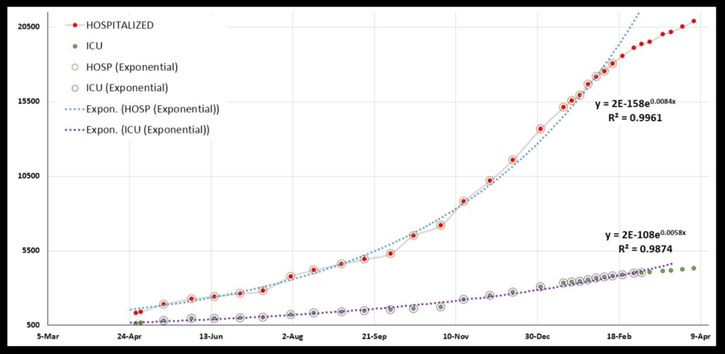
And the curve never turns back! (Or, it has not so far.) Indeed, all the graphs show that something started to change in the early months of the year. The change probably was not owed to the vaccination effort, as not that many people had been vaccinated then. Hopefully, with vaccinations open to everyone in Kentucky now, we will keep the needles jabbing, and the graphs will never turn back.
One last comment about the graphs. Look at the DEATHS, the HOSPITALIZATIONS, and the ICU graphs. Note that the rate of increase in hospitalizations and deaths is greater than the rate of increase of ICUs! The exponent value in DEATHS is 0.0085 (see the third graph); for HOSPITALIZATIONS, it is 0.0084 (fifth graph). Those are similar. That makes sense to me. But for ICUs (also fifth graph) it is 0.0058!
How can that be? Should not ICUs be right in there with hospitalizations on one side and deaths on the other? The data has me completely flummoxed there.
This data just reflects how, as time passes, we are going to learn so much about this Pandemic. We will find that we were so wrong so many times, and that we crashed around blindly, and muddled through because we got a few key things right despite getting so much wrong.
When we look at science’s history, we see that this is typical. It is fashionable today among many to say we get things wrong and crash around because of vast conspiracies on the part of governments or corporations or what-have-you. But such conspiratorial thinking comes in part from people putting Science up on a pedestal as a god of sorts (along with technology).
Science is an imperfect process conducted by imperfect human beings. The First Commandment aside, Science is a poor choice for a god. History shows its flaws all too well. But in a Great Pandemic, I sure am glad we have it.
