Among other things, my training as a physicist has included numerical modeling of complex systems. My undergraduate thesis was a simulation of stellar evolution in a close binary system. In my more recent research, I have dabbled with heat flow simulations through porous meteoritic materials. While I do not pretend to be a fully skilled programmer, this work has given me a breadth of experience with various computer languages such as C, Fortran, IDL, and Python.
So now here I am, stuck in San Jose, CA where I happened to be when the dreaded coronavirus struck. Like everyone else, I am currently housebound without the usual activities that generally keep me occupied. Like everyone else, the pandemic has presented me with discouragement, boredom, and anxiety. But I am a problem-solver, so one of my ways of coping with the uncertainty of the c-virus is to treat it as a scientific problem.
I went straight to the computer and created a model in Python to better understand virus spread.
First, a DISCLAIMER:
Everything presented below is amateur work. I do not claim to include a realistic model of human behavior. The model does not include such important factors as climate, seasonal behavioral changes, social interaction standards, public transportation, secondary transfer of the virus (through surfaces, etc), and so on. It presents a qualitative result, but I make absolutely no claims about its ability to quantitatively predict the outcome of this current pandemic. If you are looking for meaningful data, I refer all readers to the proper sources: World Health Organization, Centers for Disease Control, etc.
The Model
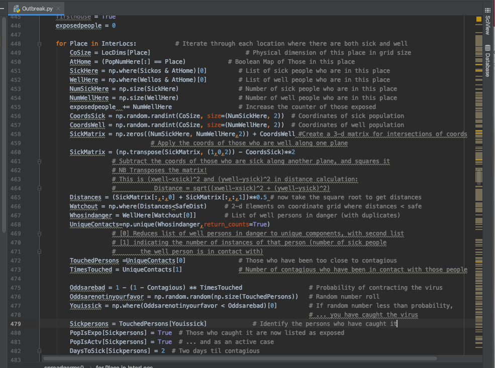 Excerpt from my Python program for the simulation.
I created a city of 200,000 citizens. Each citizen was assigned a household. Likewise, each citizen was assigned a workplace or school (based on age). Retired citizens or some few work-from-home citizens were assigned their own home as the workplace.
Households contain anywhere from 1 to 10 persons, based on a Poisson distribution centered around 2. Elementary schools hold 100 students each (plus a few teachers). High schools hold 300 students each (plus a few teachers). Each office (workplace) holds 30 people. Each venue was also assigned a physical size that would affect how closely packed together the occupants are.
Each day is divided into three time periods. In the first period, people go to their assigned work places. For those who remain at home, a certain percentage (I used 10%) will choose to visit another home or go out to public venues: shops, restaurants, or entertainment venues. (These each have different occupant capacities and physical sizes.) Any overflow ends up on the street.
In the second time period, everyone goes home from work, but some percentage (20%) will go visit other homes or public venues. Then, for the third time period, everyone goes home for the night.
One person (“patient zero”) was contaminated with the virus on day 0.
For each time period, and for each location, the occupants are randomly assigned coordinates. If a non-exposed person is within 3.5 feet of a contagious carrier, the person has a 14% chance of catching the bug. (I selected the numbers so that the rate of exponential spread mimics the rate of COVID-19 spread in the US in the first half of March.) If the person is near several carriers, then each carrier has a chance of spreading the bug.
Once a person has been exposed, they have two days before they become contagious. After that, they have anywhere from about 2 to 12 days to manifest symptoms (the bounding values are not hard cut-offs). Each sick person might be either mildly sick, very sick, or critical.
Critical cases go to the hospital, if there are sufficient beds to support them. I set the number of beds to be 2 per 1000 occupants (i.e. 400 beds), which is loosely based on the average number of available ventilators in major cities.
For each day, I recorded the cumulative number of cases, the number of active cases, the number of contagious, sick, critical, in hospital, recovered, and dead.
Mitigation Scenarios
Next, I programmed a number of scenarios in which certain mitigation strategies were invoked. These involve: keep the sick people home from work, keep the sick and their families home from work, close entertainment venues, close schools, close offices, quarantine the sick, quarantine the sick and their households, and finally the State of Emergency. In the State of Emergency, after 0.4% of the population (800 people) falls sick, schools, offices, and entertainment venues are closed, and shops have capacity reduced to only 10 persons each. In addition, during the State of Emergency the population will engage in social distancing, which in this simulation means not going out to other venues. Before running the simulation, I can set the percentage of the population that will comply to the social distancing order.
The Results
I focused on two plots: the S-curve for the cumulative number of cases over time, and the plot of critical cases vs. time (i.e. the “flatten the curve” curve). Each mitigation scenario resulted in a different percentage of the population catching the virus, and a different peak for the critical-case curve. However, the only scenarios that really made a significant dent are the ones that involve heavy quarantine and/or social distancing. While closing schools and offices is helpful and important, it only works if people STAY AT HOME.
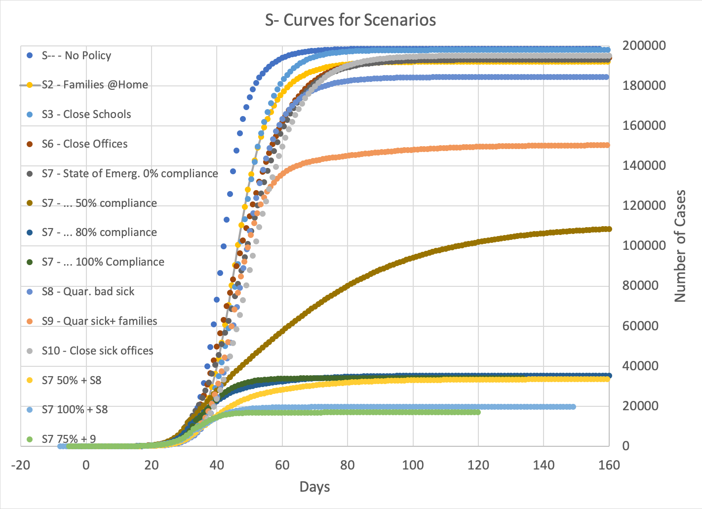 Fig 1: S-curves for most of the scenarios I ran. The total number of cases (those who have caught the virus) is plotted against time in days. All curves are time-adjusted to match when there are 100 cases. Many of the scenarios end up with over 90% of the population sick. The scenarios that don’t are the ones that involve quarantining sick and families, and those in which the population engages in social distancing.
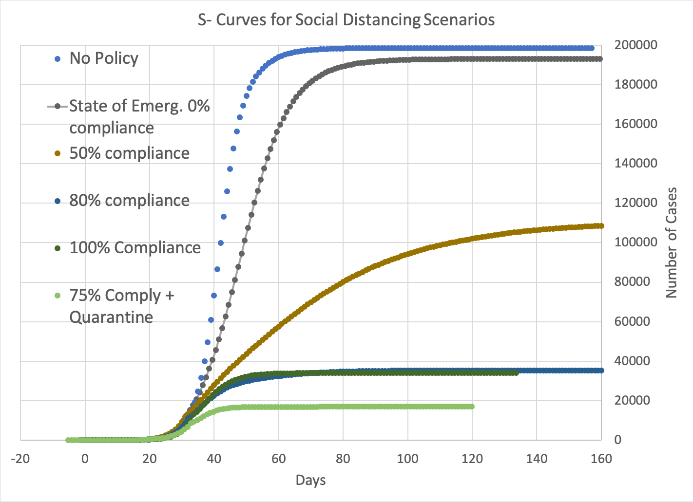 Fig. 2: This is the same plot as Fig. 1, but only showing the scenarios involving a State of Emergency (closing offices, schools, and entertainment venues, and limiting access to shops and restaurants, and calling on the public to engage in social distancing), called when 800 persons (0.4% of the population) become sick. For comparison, the “no policy” curve is shown in blue.
In the scenario where a State of Emergency is called, but 0% of the population is compliant to social distancing rules, then the curve is similar to one with no policy at all. The most effective of the scenarios that I ran is one in which 75% of the population complied, coupled with quarantining the households of sick persons. This scenario had the fewest deaths and ends in the shortest time.
The quagmire is with only moderate (50%) compliance, where the number of daily new cases and recoveries/deaths balances out. This scenario drags on for over a year in simulation time.
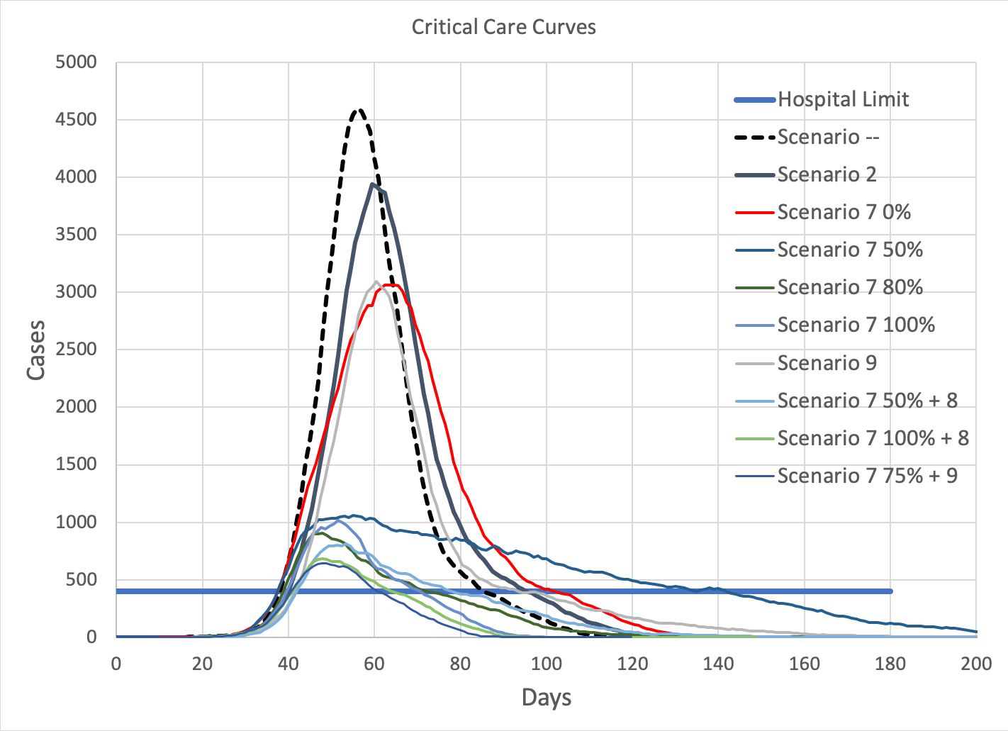 Fig. 3: Number of critical cases vs time (in days). The thick blue horizontal line marks the number of hospital critical-care beds available.
All mitigation scenarios reduce the peak of the curve somewhat, but only those that involve social distancing (Scenario 7 with more than 0% compliance) drastically reduce the peak to a nearly-manageable level.
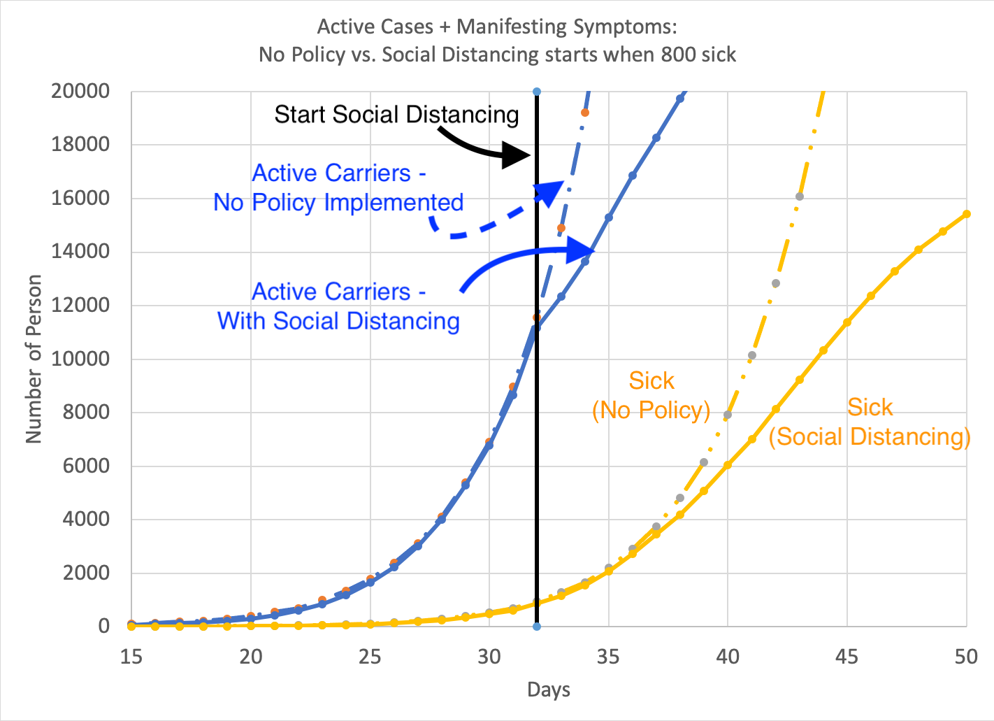 Fig. 4: What happens when the population engages in social distancing. The black line denotes the day that this policy is implemented.
Blue curves denote the number of active carriers of the virus. (Dashed = no policy, solid = with social distancing.) Yellow curves are the current number of sick persons.
When a policy is implemented, the number of sick persons (i.e. known cases) is only a fraction of the number of people actually carrying the virus. Thus, despite the policies, the number of sick people will continue to grow, and the number of cases will also continue to rise for a while due to the contagious carriers who are not yet sick.
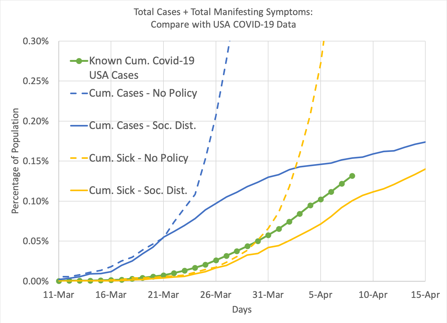 Fig. 5: For a lark, I thought I would compare my model with real data. I used the USA case data from worldometer.info. Since a single city is not comparable to a country, I reduced both to a percentage of the population. Then I re-ran the simulation to trigger the State of Emergency with 75% social distancing at such time when the statistics were comparable to US data in mid-March. Blue curves are cumulative number of cases (both sick and those not known to be sick), with dashed representing the baseline and solid representing the state-of-emergency. Yellow curves are cumulative number of sick persons. The green dots represent actual COVID-19 case data from the interwebs. Note that it is more representative of the sick than the total number of cases, because testing is mostly limited to those already sick.